Introduction
 Electromagnetic Fields Visualization
By Lindsay Grace
University of Illinois,Chicago
Working as a pair, Brian Uphoff and I set out to record the electromagnetic
emissions of standard household dryer. We hoped to then accurately visualize
the cloud of electromagnetic activity around the dryer.
Data Acquisition
We considered two approaches to recording the data. Originally I prepared
a box with 1 centimeter grid lines across the length, width and depth.
I hoped to move the censor across these lines while recoding the sensors
readings. This approach was discarded for two reasons:
The box's dimensions were proven to be too small to capture all of the
electromagnetic activity
The centimeter resolution was estimated to be too fine for our visualization
needs
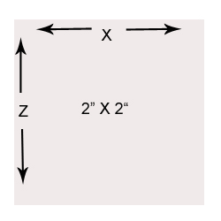
Our final solution was much more exotic. The hair dryer was suspended from the ceiling, while measurements were recorded along the plane below the dryer. The recording plane was comprised of 2 x 2 inch grid, for X and Z values The distance between the recording plane and the suspended dryer described the Y. This created a nice regular grid of 2 inch real-world voxels.
 We
recorded 10 x 8 x 8 grid, with 640 points. There are approximate 6 cells
in our grid that represent the interior of the hair dryer. The points
were not recorded.
We
recorded 10 x 8 x 8 grid, with 640 points. There are approximate 6 cells
in our grid that represent the interior of the hair dryer. The points
were not recorded.
Brian read the sensor values while I recorded them in OpenOffice Calc. Each team member was given a single table of values for all of the data.
Data Clean Up
We began independent work on the project by completing our own data organization. I chose to create two different data sets form the recorded data. A comma separated point list with scalars, and a 2D image slice.
I chose to to convert the spreadsheet file to comma separated values describing each point in a single tuple. The file format contains the x,y,z and sensor reading value for a single reading on each row. This file is parsed easily and is useful for scalar, point based visualizations.
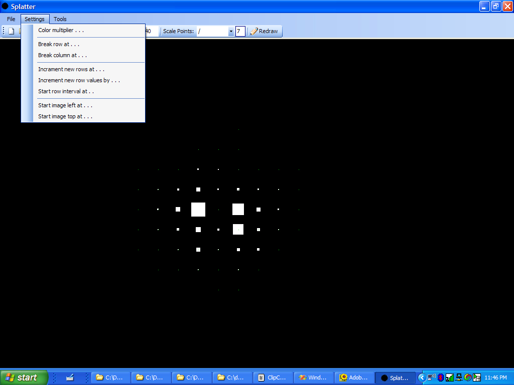
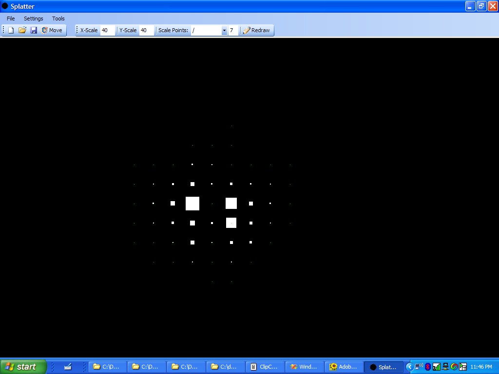
I also chose to convert the files to 2D image slices. I created the “splotter” (splat plotter) program to create height map-like images of the data. The splotter program reads any CSV file and draws 2D points on a black plane. Keeping with good software design principles, the applications is designed to reusable. It reads any reasonable grid of commas separated values containing an X,Y,Z and optional scalar value. The program then renders points according to user specified rules. Splotter allows the user to change scale and move points or “splots.” The following screenshot depicts splotter's interface and a an image created for this project. Splotter allows the user to write 2D images in all popular formats.
Data Visualization
To visualize the data I chose two primary techniques. The most logical was a Gaussian splatting. The data set is fairly low resolution, and lacks orientation, time. Splatting makes particular sense because the data set proved to have substantial sparsity. I also thought it would be useful to graph the data in 3 dimensions. Based on short, simple research It seemed it might be useful to identify em rates and spatial relationships.
Splats:
 Aesthetically
and practically splats yielded the most valuable visualizations. The splats
illustrate the arcing and circular behavior of the em activity. The splats
are also fairly easy to understand. Having never taken a course in physics
not college level chemistry, my test of accuracy amounts to comparing
these images to other images created by researchers. The splats yield
a similar to dual sphere shape around the center of the em source.
Aesthetically
and practically splats yielded the most valuable visualizations. The splats
illustrate the arcing and circular behavior of the em activity. The splats
are also fairly easy to understand. Having never taken a course in physics
not college level chemistry, my test of accuracy amounts to comparing
these images to other images created by researchers. The splats yield
a similar to dual sphere shape around the center of the em source.
Several screenshots of these splats are avaialable here . . .
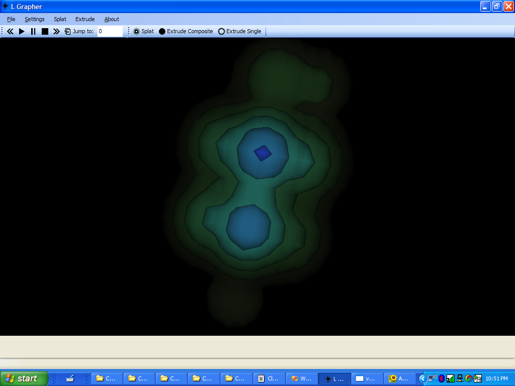
 I
also thought it would be useful to create a composite 3D contour of the
data. I did so by creating 2D image slices with splotter, then contouring
the files as a multi-slice volume. I also allow the user to splice the
render by choosing which of the 8 Yvalues they want to include in the
contour render.
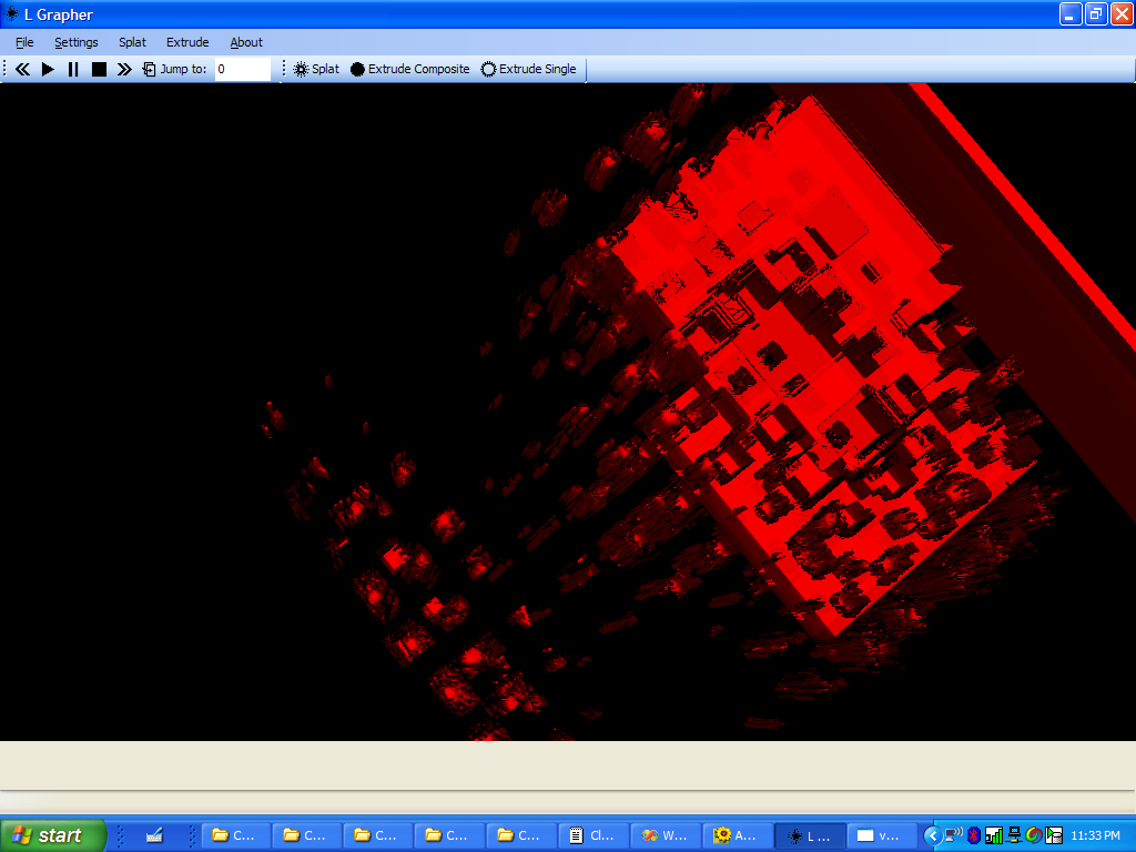
I
also thought it would be useful to create a composite 3D contour of the
data. I did so by creating 2D image slices with splotter, then contouring
the files as a multi-slice volume. I also allow the user to splice the
render by choosing which of the 8 Yvalues they want to include in the
contour render.
The 3D composite contours can be viewed here . . .
Lastly, using “legacy” code from mylast project I rendered a few height maps of the data. These are only useful in that they show where spikes of em intensity occurred. As expected the em intensity dies off fairly quickly.
The height maps can be viewed here . . .
Observations
The data may have be tainted by a few environmental em miters in the lab where we recored our data. In particular there is a light surge of em activity at the Z end of the data set. This em activity might be the residual arc of em from the dryer. It may also be em emitted from the surge protector, web camera, and projected just outside our recording grid.
It is not clear if it would have been useful to record the data by recording the sensors reading at multiple orientations. While experimenting in the lab, we did not see substantial change in the sensor reading for 2 of the 3 axis. Since the hair dryer is also motor driven device, the em field would likely have been variable. However, it would have been interesting to attempt record the movement of the em field. We considered trying to record the data at startup and comparing it to prolonged use, but the mechanics of this version of the study would have been unreasonable.
Technical Implementation
This project was completed using Microsoft Visual Basic .Net and C# .Net.
It used the Visualization Tool Kit for 3D renders and good old fashioned
VB for 2D renders.
All executables and resource files can be downloaded here.
The following are a few screen shots of our “lab.”
Resources
Click here to view the 2D "splots" . . .
Download Splotter (just exe - 140k)
Download EM Field Viewer (exe
and resources - ~2mb)
Download CSV (4k) - for EM viewer